
OVERVIEW
As part of the BVCC Winter Student Consulting Project, I collaborated with the BVCC Studios team and a group of student consultants to craft an end-to-end user experience for Vitable Health, a venture capital partner within the BVCC network. My contributions included defining how we could leverage automation to supercharge the Vitable Health platform. This involved designing an AI-automated system and utilizing the company's design system to build and enhance the user experience.
40px
Who is Vitable Health?
Vitable Health is a (VC) health care insurance company that provides affordable hassle free healthcare plans for customers of all tax brackets. They provide to all users within their domain with a plethora of benefits where they are able to access at their fingertips.
Project Type
Mobile App
Duration
7 Weeks (Jan - Marc 2024)
Role
UX Consultant
Team
1 Leading Project Manager
1 Associate Project Manager
1 Content Designer
Success Metrics
Task completion and user satisfaction
THE PROBLEM
When sharing about Vitable Health, we were presented with the existing state of the company and the current product. It was shared with us that Vitable Health has a lot of touch points within the organization from the Director of BVCC Studios.
32px
“Vitable has many touchpoints, they have members, providers, and staff. The mission within Vitable Health is a very personal and relevant topic.”
- Josh Lind, BVCC Studios Director
32px
It was presented as a problem because as the platform increased in usage and user traction, the touch points within the organization needed to be addressed to help with future experiences within of the company.
40px
The goal
The goal for the project was presented in this question:
32px
How might we leverage automation to enhance the user experience within the Vitable Health app and ecosystem by optimizing touchpoints and interactions between members, providers, and Vitable staff?
40px
The focus
We wanted to come up with a solution that would address the root of the problem. We decided to focus on the ideal opportunities that would benefit the most through automation. With the expectation of automation being used, we ran this hypothesis:
32px
With the expectation of automation being used, we ran this hypothesis:
IF touchpoints within Vitable Health can be addressed, THEN production can increase and tasks can be completed quicker.
40px
The process
After conducting research with the Vitable Team, we were able to land on 3 potential solutions that helped address the problem, based on the hypothesis we were running for the project. Through the potential solutions that we found, we were able to create a framework graph that touched on the 3 possible product solution. We organized the prioritization levels, based on how the product will affect the current problem we are solving based on the prompt given.
32px
Product idea
Impact
Effort
Priority level
Communication Breakdown
Vitable Team
Providers
Descibed as too complicated to handle, but something to look into.
P1
Schedule Building
Vitable Team
Providers
Clients
Benefits all touch points and could see the potential of using in the app.
P0
Usability Testing
Vitable Team
Not a lot of time to go through, due to time constraint.
P2
12px
Fig. 1 — (Value vs. Effort Framework)
32px
When working through concept building, we selected the “scheduling building’ concept and the “Communication breakdown” concept to work with to help us have a better understanding of how automation could be leveraged within these spaces.
40px
DESIGNING & TESTING
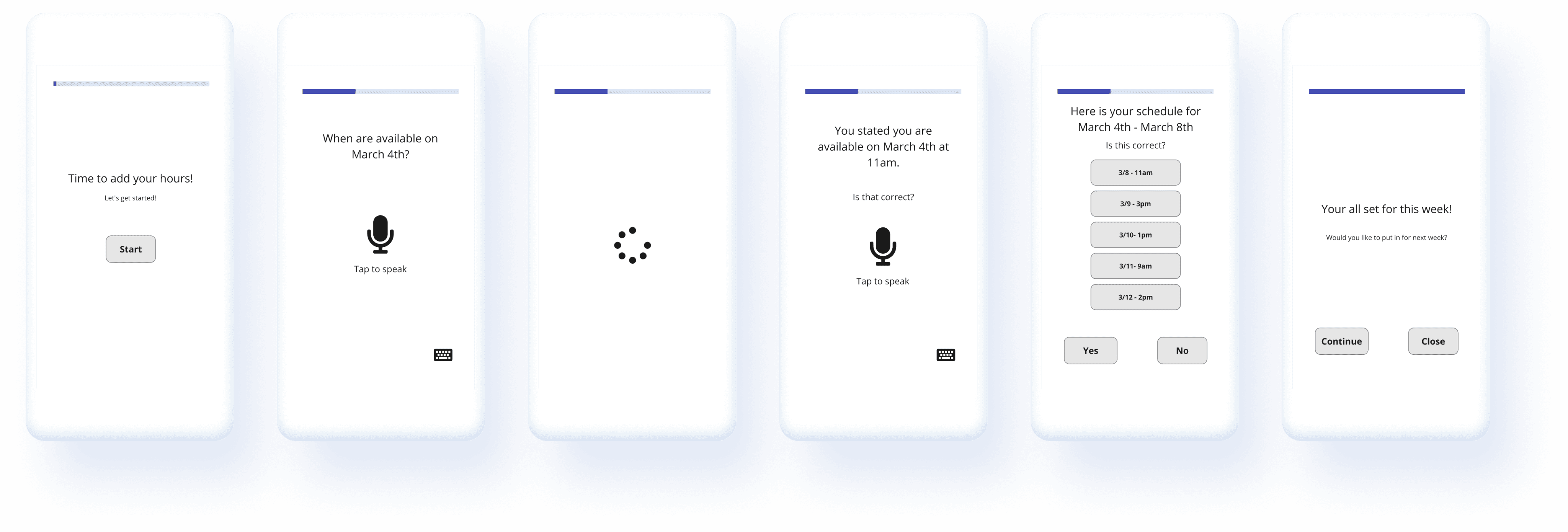
I took the opportunity to create two lofi concepts to help see which solution the user would gravitate towards. We had the chance to interview 4 people for the solutions we were testing through the project.
32px

12px
Fig. 2 - Lofi concept 1 (Schedule Building)
32px



12px
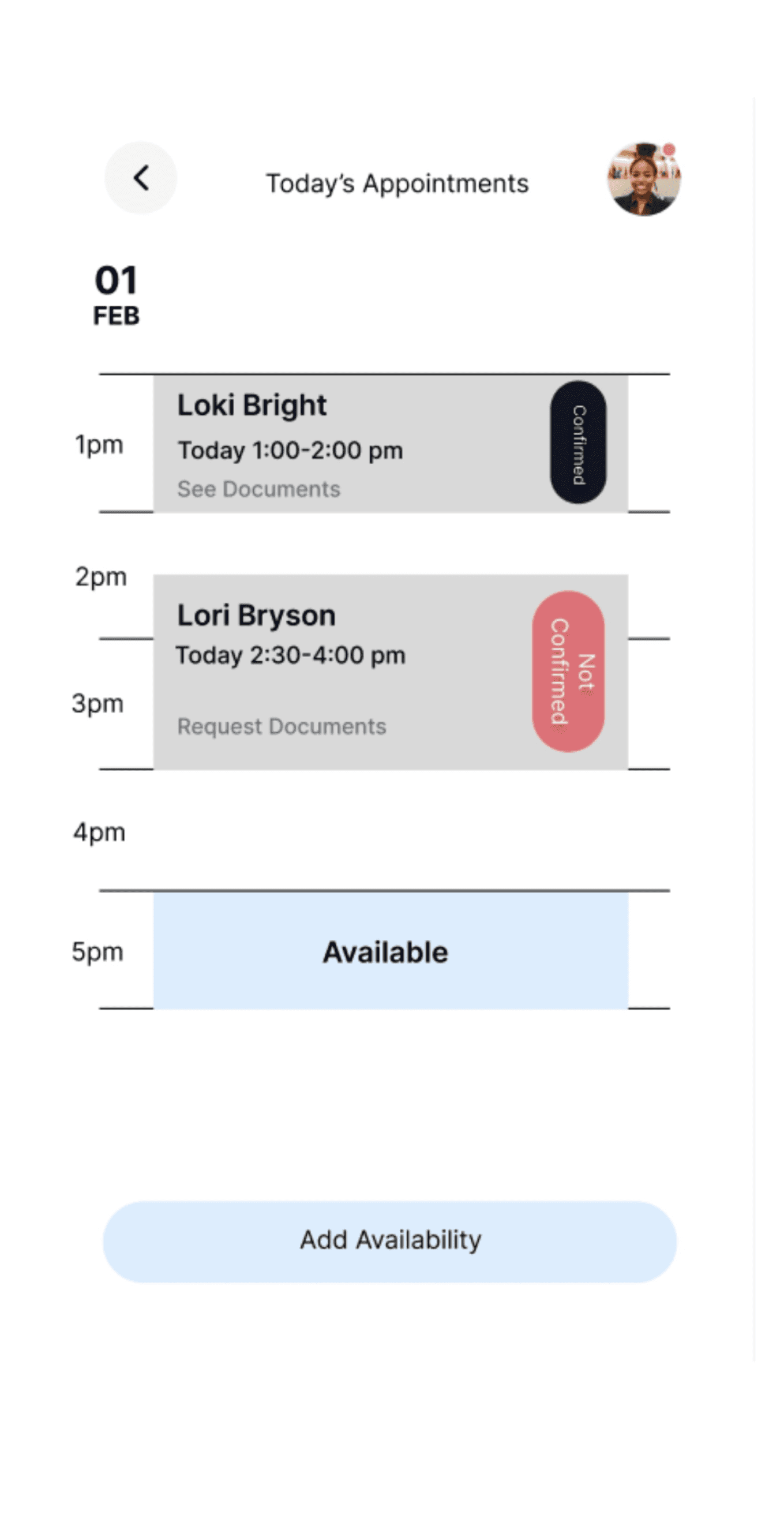
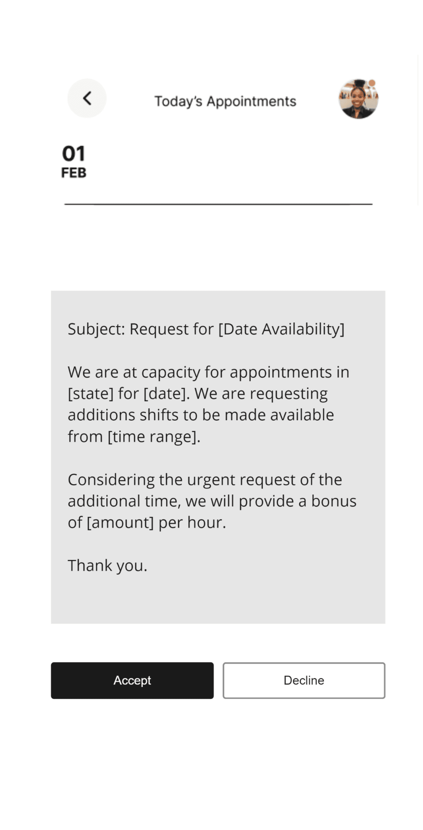
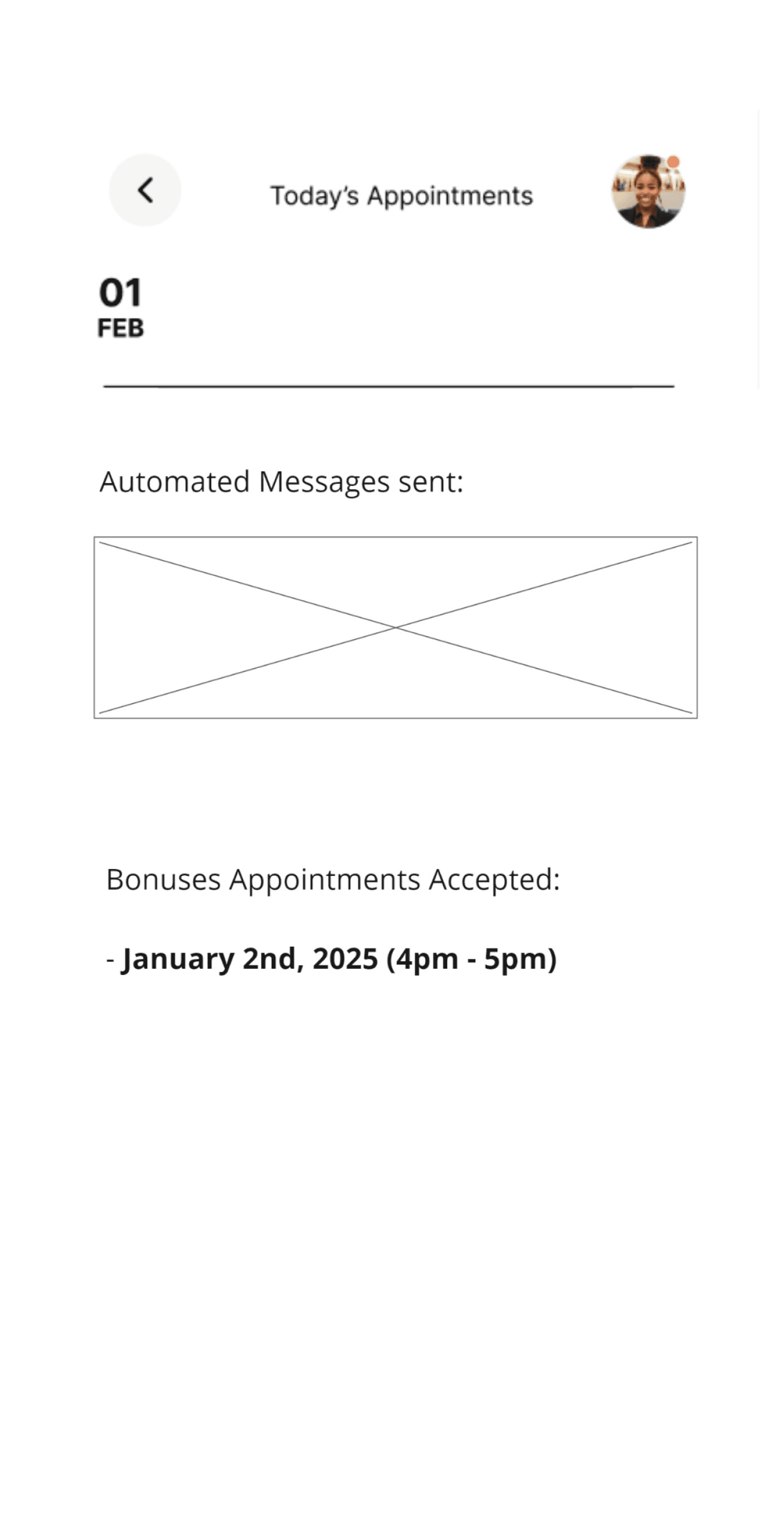
Fig. 3 - Lofi concept 2 (Communication Breakdown - Overtime request)
32px
When testing our solutions, we found that 3/4 users gravitated towards the “schedule bundling” concept more due to the way they interacted with the lofi prototype.
32px
“I liked concept one because it actually is something I would use when putting my schedule. Usually I would do everything on the google forum, but something like this would be extremely helpful”. - User 1
12px
“Because of the variety of other applications out there, it is nice to have a system that fits what I do”. - User 2
32px
When working through the user testings for the concepts, I was surprised how the users gravitated towards the scheduling building concept more than the other. With the second concept, the users felt more confused and unsure how the product will help them, and after looking through my notes and research, we found that the second concept would not help target the whole Vitable Health ecosystem, just the providers.
32px
40px
Design - First pass
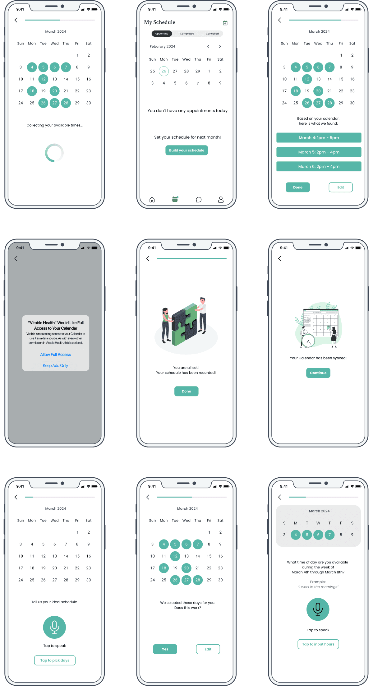
When working through the first design pass for the scheduling building product, we decided to go through usability testing based on the first design pass of the product.
32px

12px
Fig. 4 - First designs pass
32px
We found that the experience was “too clicky” as they went through the experience. It did not work as expected because we wanted a concept to give the user a choice through the process even though automation is used, but we are still too user heavy.
32px
“When going through the process, it is too ‘clicky”. I would want something where I can just put it in a don’t have to do anything else ”. - User 1
12px
“So...am I finished? I don’t see where it let’s me know if I am done?” - User 2
32px
With the feedback we got after the usability testing, we decided to create a new flow, but make the process more “hands free”. This had us going back into our research with supported insights to see how automation can be “hands free” within a product. We tested different automation ideas and tools like calendar integration, AI chat rooms, and other automated tools from existing products.
40px
Consulting the final product
We finally landed with a new design that we shared with the stakeholders of Vitable Health and BVCC to consult the designs and how the product will work through in the app.
32px
When sharing the product through stakeholders, they shared concerns about if the product would interfere with the current product that is out currently. Also due to the level of complexity of the product, they worried that this feature would not be able to either be built, or released within the timeframe we had due to the automation concept we shared and would have to descoping the product.
32px

12px
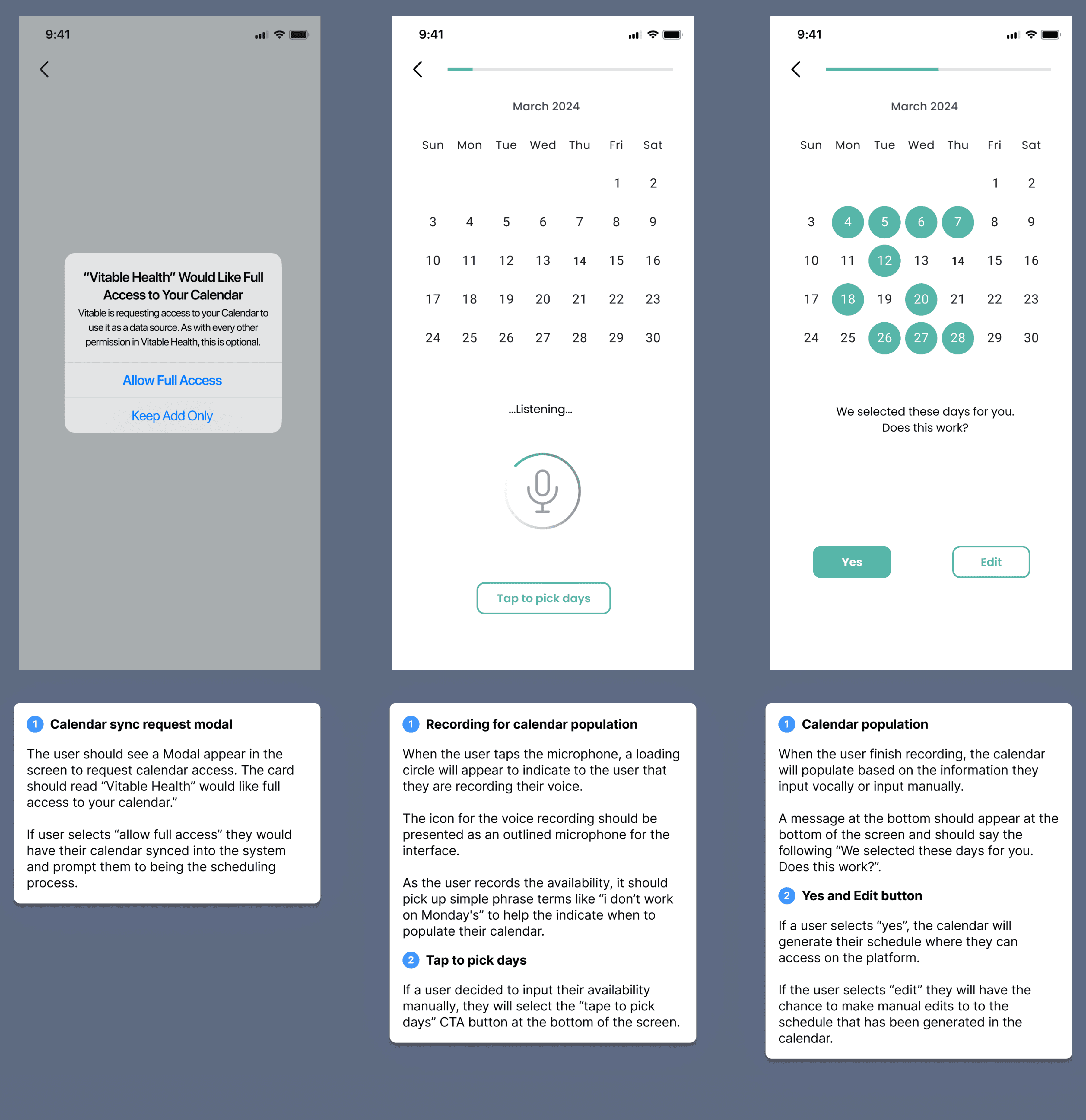
(Annotation designs)
32px
When discussing with stakeholders the concerns regarding the product, we shared that it would not interfere with the current product that is out right now, it will follow the same interface design and style from the original platform, and would just change only 1 part within the design, which would be adding time slots within the calendar dashboard. Regarding descoping, I explained to them that the project should be showcased on the platform with the level of priority due to the insights we found within working through the product, and the supporting data from the usability testing.
40px
Preparing for Takeoff
32px
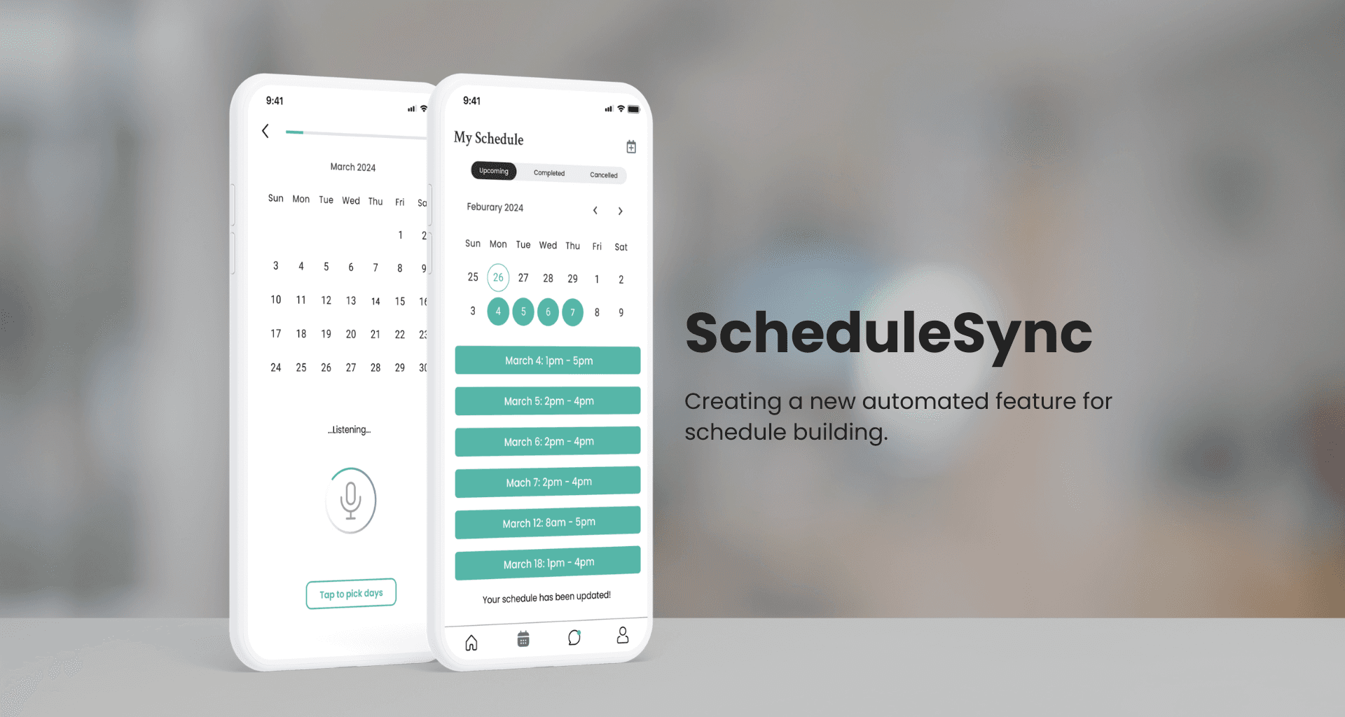
With the product completely built and shipped, we created “Schedulesync” a feature product that helped with syncing your calendar within the Vitable Health schedule to collect providers availability quickly and effectively, and showcase to clients immediately, while the Vitable team can track providers times and schedules all through the app.
32px
Schedulesync
ScheduleSync played a pivotal role in addressing key outcomes within the Vitable ecosystem:
The product will streamline the entire scheduling process by automating the collection of provider availability, significantly reducing the potential for human error and administrative burden on Vitable staff.
The automation enabled providers to input their schedules faster than ever before, while staff could efficiently gather and manage this information in a timely manner, ensuring smooth operations.
ScheduleSync created a seamless monthly scheduling process, improving communication and interaction between staff and providers, and clients.
12px
(Launch - Ready Design)
40px
REFLECTION
This was my very first time as a consultant for a project and it was definitely an eye-opening experience. One of the key takeaways from this project that I can definitely carry on with me or the rest of my projects is to constantly question things. The reason for questioning everything is to keep your mind thinking outside of the box, rather than just sticking with the status quo. There were multiple times through this project where I thought having too many questions or asking myself too many questions was a bad thing, but through my support of my mentors, functional leads and my team members, I saw this as a superpower and a way for me to create concepts that not only help people, but leave an impact as well.
32px
I help users and companies make a lasting impact by designing intuitive user experiences and visuals, driving engagement and
enhancing business outcomes.


OVERVIEW
As part of the BVCC Winter Student Consulting Project, I collaborated with the BVCC Studios team and a group of student consultants to craft an end-to-end user experience for Vitable Health, a venture capital partner within the BVCC network. My contributions included defining how we could leverage automation to supercharge the Vitable Health platform. This involved designing an AI-automated system and utilizing the company's design system to build and enhance the user experience.
40px
Who is Vitable Health?
Vitable Health is a (VC) health care insurance company that provides affordable hassle free healthcare plans for customers of all tax brackets. They provide to all users within their domain with a plethora of benefits where they are able to access at their fingertips.
Project Type
Mobile App
Duration
7 Weeks (Jan - Marc 2024)
Role
UX Consultant
Team
1 Leading Project Manager
1 Associate Project Manager
1 Content Designer
Success Metrics
Task completion and user satisfaction
THE PROBLEM
When sharing about Vitable Health, we were presented with the existing state of the company and the current product. It was shared with us that Vitable Health has a lot of touch points within the organization from the Director of BVCC Studios.
32px
“Vitable has many touchpoints, they have members, providers, and staff. The mission within Vitable Health is a very personal and relevant topic.”
- Josh Lind, BVCC Studios Director
32px
It was presented as a problem because as the platform increased in usage and user traction, the touch points within the organization needed to be addressed to help with future experiences within of the company.
40px
The goal
The goal for the project was presented in this question:
32px
How might we leverage automation to enhance the user experience within the Vitable Health app and ecosystem by optimizing touchpoints and interactions between members, providers, and Vitable staff?
40px
The focus
We wanted to come up with a solution that would address the root of the problem. We decided to focus on the ideal opportunities that would benefit the most through automation. With the expectation of automation being used, we ran this hypothesis:
32px
With the expectation of automation being used, we ran this hypothesis:
IF touchpoints within Vitable Health can be addressed, THEN production can increase and tasks can be completed quicker.
40px
The process
After conducting research with the Vitable Team, we were able to land on 3 potential solutions that helped address the problem, based on the hypothesis we were running for the project. Through the potential solutions that we found, we were able to create a framework graph that touched on the 3 possible product solution. We organized the prioritization levels, based on how the product will affect the current problem we are solving based on the prompt given.
32px
Product idea
Impact
Effort
Priority level
Communication Breakdown
Vitable Team
Providers
Descibed as too complicated to handle, but something to look into.
P1
Schedule Building
Vitable Team
Providers
Clients
Benefits all touch points and could see the potential of using in the app.
P0
Usability Testing
Vitable Team
Not a lot of time to go through, due to time constraint.
P2
12px
Fig. 1 — (Value vs. Effort Framework)
32px
When working through concept building, we selected the “scheduling building’ concept and the “Communication breakdown” concept to work with to help us have a better understanding of how automation could be leveraged within these spaces.
40px
DESIGNING & TESTING
I took the opportunity to create two lofi concepts to help see which solution the user would gravitate towards. We had the chance to interview 4 people for the solutions we were testing through the project.
32px


12px
Fig. 2 - Lofi concept 1 (Schedule Building)
32px


12px
Fig. 3 - Lofi concept 2 (Communication Breakdown - Overtime request)
32px
When testing our solutions, we found that 3/4 users gravitated towards the “schedule bundling” concept more due to the way they interacted with the lofi prototype.
32px
“I liked concept one because it actually is something I would use when putting my schedule. Usually I would do everything on the google forum, but something like this would be extremely helpful”. - User 1
12px
“Because of the variety of other applications out there, it is nice to have a system that fits what I do”. - User 2
32px
When working through the user testings for the concepts, I was surprised how the users gravitated towards the scheduling building concept more than the other. With the second concept, the users felt more confused and unsure how the product will help them, and after looking through my notes and research, we found that the second concept would not help target the whole Vitable Health ecosystem, just the providers.
32px
40px
Design - First pass
When working through the first design pass for the scheduling building product, we decided to go through usability testing based on the first design pass of the product.
32px


12px
Fig. 4 - First designs pass
32px
We found that the experience was “too clicky” as they went through the experience. It did not work as expected because we wanted a concept to give the user a choice through the process even though automation is used, but we are still too user heavy.
32px
“When going through the process, it is too ‘clicky”. I would want something where I can just put it in a don’t have to do anything else ”. - User 1
12px
“So...am I finished? I don’t see where it let’s me know if I am done?” - User 2
32px
With the feedback we got after the usability testing, we decided to create a new flow, but make the process more “hands free”. This had us going back into our research with supported insights to see how automation can be “hands free” within a product. We tested different automation ideas and tools like calendar integration, AI chat rooms, and other automated tools from existing products.
40px
Consulting the final product
We finally landed with a new design that we shared with the stakeholders of Vitable Health and BVCC to consult the designs and how the product will work through in the app.
32px
When sharing the product through stakeholders, they shared concerns about if the product would interfere with the current product that is out currently. Also due to the level of complexity of the product, they worried that this feature would not be able to either be built, or released within the timeframe we had due to the automation concept we shared and would have to descoping the product.
32px


12px
(Annotation designs)
32px
When discussing with stakeholders the concerns regarding the product, we shared that it would not interfere with the current product that is out right now, it will follow the same interface design and style from the original platform, and would just change only 1 part within the design, which would be adding time slots within the calendar dashboard. Regarding descoping, I explained to them that the project should be showcased on the platform with the level of priority due to the insights we found within working through the product, and the supporting data from the usability testing.
40px
Preparing for Takeoff
32px
With the product completely built and shipped, we created “Schedulesync” a feature product that helped with syncing your calendar within the Vitable Health schedule to collect providers availability quickly and effectively, and showcase to clients immediately, while the Vitable team can track providers times and schedules all through the app.
32px
Schedulesync
ScheduleSync played a pivotal role in addressing key outcomes within the Vitable ecosystem:
The product will streamline the entire scheduling process by automating the collection of provider availability, significantly reducing the potential for human error and administrative burden on Vitable staff.
The automation enabled providers to input their schedules faster than ever before, while staff could efficiently gather and manage this information in a timely manner, ensuring smooth operations.
ScheduleSync created a seamless monthly scheduling process, improving communication and interaction between staff and providers, and clients.
12px
(Launch - Ready Design)
40px
REFLECTION
This was my very first time as a consultant for a project and it was definitely an eye-opening experience. One of the key takeaways from this project that I can definitely carry on with me or the rest of my projects is to constantly question things. The reason for questioning everything is to keep your mind thinking outside of the box, rather than just sticking with the status quo. There were multiple times through this project where I thought having too many questions or asking myself too many questions was a bad thing, but through my support of my mentors, functional leads and my team members, I saw this as a superpower and a way for me to create concepts that not only help people, but leave an impact as well.
32px
I help users and companies make a lasting impact by designing intuitive user experiences and visuals, driving engagement and
enhancing business outcomes.
OVERVIEW
As part of the BVCC Winter Student Consulting Project, I collaborated with the BVCC Studios team and a group of student consultants to craft an end-to-end user experience for Vitable Health, a venture capital partner within the BVCC network. My contributions included defining how we could leverage automation to supercharge the Vitable Health platform. This involved designing an AI-automated system and utilizing the company's design system to build and enhance the user experience.
40px
Who is Vitable Health?
Vitable Health is a (VC) health care insurance company that provides affordable hassle free healthcare plans for customers of all tax brackets. They provide to all users within their domain with a plethora of benefits where they are able to access at their fingertips.
Project Type
Mobile App
Duration
7 Weeks (Jan - Marc 2024)
Role
UX Consultant
Team
1 Leading Project Manager
1 Associate Project Manager
1 Content Designer
Success Metrics
Task completion and user satisfaction
THE PROBLEM
When sharing about Vitable Health, we were presented with the existing state of the company and the current product. It was shared with us that Vitable Health has a lot of touch points within the organization from the Director of BVCC Studios.
32px
“Vitable has many touchpoints, they have members, providers, and staff. The mission within Vitable Health is a very personal and relevant topic.”
- Josh Lind, BVCC Studios Director
32px
It was presented as a problem because as the platform increased in usage and user traction, the touch points within the organization needed to be addressed to help with future experiences within of the company.
40px
The goal
The goal for the project was presented in this question:
32px
How might we leverage automation to enhance the user experience within the Vitable Health app and ecosystem by optimizing touchpoints and interactions between members, providers, and Vitable staff?
40px
The focus
We wanted to come up with a solution that would address the root of the problem. We decided to focus on the ideal opportunities that would benefit the most through automation. With the expectation of automation being used, we ran this hypothesis:
32px
With the expectation of automation being used, we ran this hypothesis:
IF touchpoints within Vitable Health can be addressed, THEN production can increase and tasks can be completed quicker.
40px
The process
After conducting research with the Vitable Team, we were able to land on 3 potential solutions that helped address the problem, based on the hypothesis we were running for the project. Through the potential solutions that we found, we were able to create a framework graph that touched on the 3 possible product solution. We organized the prioritization levels, based on how the product will affect the current problem we are solving based on the prompt given.
32px
Product idea
Impact
Effort
Priority level
Communication Breakdown
Vitable Team
Providers
Descibed as too complicated to handle, but something to look into.
P1
Schedule Building
Vitable Team
Providers
Clients
Benefits all touch points and could see the potential of using in the app.
P0
Usability Testing
Vitable Team
Not a lot of time to go through, due to time constraint.
P2
12px
Fig. 1 — (Value vs. Effort Framework)
32px
When working through concept building, we selected the “scheduling building’ concept and the “Communication breakdown” concept to work with to help us have a better understanding of how automation could be leveraged within these spaces.
40px
DESIGNING & TESTING
I took the opportunity to create two lofi concepts to help see which solution the user would gravitate towards. We had the chance to interview 4 people for the solutions we were testing through the project.
32px

12px
Fig. 2 - Lofi concept 1 (Schedule Building)
32px


12px
Fig. 3 - Lofi concept 2 (Communication Breakdown - Overtime request)
32px
When testing our solutions, we found that 3/4 users gravitated towards the “schedule bundling” concept more due to the way they interacted with the lofi prototype.
32px
“I liked concept one because it actually is something I would use when putting my schedule. Usually I would do everything on the google forum, but something like this would be extremely helpful”. - User 1
12px
“Because of the variety of other applications out there, it is nice to have a system that fits what I do”. - User 2
32px
When working through the user testings for the concepts, I was surprised how the users gravitated towards the scheduling building concept more than the other. With the second concept, the users felt more confused and unsure how the product will help them, and after looking through my notes and research, we found that the second concept would not help target the whole Vitable Health ecosystem, just the providers.
32px
40px
Design - First pass
When working through the first design pass for the scheduling building product, we decided to go through usability testing based on the first design pass of the product.
32px

12px
Fig. 4 - First designs pass
32px
We found that the experience was “too clicky” as they went through the experience. It did not work as expected because we wanted a concept to give the user a choice through the process even though automation is used, but we are still too user heavy.
32px
“When going through the process, it is too ‘clicky”. I would want something where I can just put it in a don’t have to do anything else ”. - User 1
12px
“So...am I finished? I don’t see where it let’s me know if I am done?” - User 2
32px
With the feedback we got after the usability testing, we decided to create a new flow, but make the process more “hands free”. This had us going back into our research with supported insights to see how automation can be “hands free” within a product. We tested different automation ideas and tools like calendar integration, AI chat rooms, and other automated tools from existing products.
40px
Consulting the final product
We finally landed with a new design that we shared with the stakeholders of Vitable Health and BVCC to consult the designs and how the product will work through in the app.
32px
When sharing the product through stakeholders, they shared concerns about if the product would interfere with the current product that is out currently. Also due to the level of complexity of the product, they worried that this feature would not be able to either be built, or released within the timeframe we had due to the automation concept we shared and would have to descoping the product.
32px

12px
(Annotation designs)
32px
When discussing with stakeholders the concerns regarding the product, we shared that it would not interfere with the current product that is out right now, it will follow the same interface design and style from the original platform, and would just change only 1 part within the design, which would be adding time slots within the calendar dashboard. Regarding descoping, I explained to them that the project should be showcased on the platform with the level of priority due to the insights we found within working through the product, and the supporting data from the usability testing.
40px
Preparing for Takeoff
32px
With the product completely built and shipped, we created “Schedulesync” a feature product that helped with syncing your calendar within the Vitable Health schedule to collect providers availability quickly and effectively, and showcase to clients immediately, while the Vitable team can track providers times and schedules all through the app.
32px
Schedulesync
ScheduleSync played a pivotal role in addressing key outcomes within the Vitable ecosystem:
The product will streamline the entire scheduling process by automating the collection of provider availability, significantly reducing the potential for human error and administrative burden on Vitable staff.
The automation enabled providers to input their schedules faster than ever before, while staff could efficiently gather and manage this information in a timely manner, ensuring smooth operations.
ScheduleSync created a seamless monthly scheduling process, improving communication and interaction between staff and providers, and clients.
12px
(Launch - Ready Design)
40px
REFLECTION
This was my very first time as a consultant for a project and it was definitely an eye-opening experience. One of the key takeaways from this project that I can definitely carry on with me or the rest of my projects is to constantly question things. The reason for questioning everything is to keep your mind thinking outside of the box, rather than just sticking with the status quo. There were multiple times through this project where I thought having too many questions or asking myself too many questions was a bad thing, but through my support of my mentors, functional leads and my team members, I saw this as a superpower and a way for me to create concepts that not only help people, but leave an impact as well.
32px
I help users and companies make a lasting impact by designing intuitive user experiences and visuals, driving engagement and
enhancing business outcomes.


OVERVIEW
As part of the BVCC Winter Student Consulting Project, I collaborated with the BVCC Studios team and a group of student consultants to craft an end-to-end user experience for Vitable Health, a venture capital partner within the BVCC network. My contributions included defining how we could leverage automation to supercharge the Vitable Health platform. This involved designing an AI-automated system and utilizing the company's design system to build and enhance the user experience.
40px
Who is Vitable Health?
Vitable Health is a (VC) health care insurance company that provides affordable hassle free healthcare plans for customers of all tax brackets. They provide to all users within their domain with a plethora of benefits where they are able to access at their fingertips.
Project Type
Mobile App
Duration
7 Weeks (Jan - Marc 2024)
Role
UX Consultant
Team
1 Leading Project Manager
1 Associate Project Manager
1 Content Designer
Success Metrics
Task completion and user satisfaction
THE PROBLEM
When sharing about Vitable Health, we were presented with the existing state of the company and the current product. It was shared with us that Vitable Health has a lot of touch points within the organization from the Director of BVCC Studios.
32px
“Vitable has many touchpoints, they have members, providers, and staff. The mission within Vitable Health is a very personal and relevant topic.”
- Josh Lind, BVCC Studios Director
32px
It was presented as a problem because as the platform increased in usage and user traction, the touch points within the organization needed to be addressed to help with future experiences within of the company.
40px
The goal
The goal for the project was presented in this question:
32px
How might we leverage automation to enhance the user experience within the Vitable Health app and ecosystem by optimizing touchpoints and interactions between members, providers, and Vitable staff?
40px
The focus
We wanted to come up with a solution that would address the root of the problem. We decided to focus on the ideal opportunities that would benefit the most through automation. With the expectation of automation being used, we ran this hypothesis:
32px
With the expectation of automation being used, we ran this hypothesis:
IF touchpoints within Vitable Health can be addressed, THEN production can increase and tasks can be completed quicker.
40px
The process
After conducting research with the Vitable Team, we were able to land on 3 potential solutions that helped address the problem, based on the hypothesis we were running for the project. Through the potential solutions that we found, we were able to create a framework graph that touched on the 3 possible product solution. We organized the prioritization levels, based on how the product will affect the current problem we are solving based on the prompt given.
32px
Product idea
Impact
Effort
Priority level
Communication Breakdown
Vitable Team
Providers
Descibed as too complicated to handle, but something to look into.
P1
Schedule Building
Vitable Team
Providers
Clients
Benefits all touch points and could see the potential of using in the app.
P0
Usability Testing
Vitable Team
Not a lot of time to go through, due to time constraint.
P2
12px
Fig. 1 — (Value vs. Effort Framework)
32px
When working through concept building, we selected the “scheduling building’ concept and the “Communication breakdown” concept to work with to help us have a better understanding of how automation could be leveraged within these spaces.
40px
DESIGNING & TESTING
I took the opportunity to create two lofi concepts to help see which solution the user would gravitate towards. We had the chance to interview 4 people for the solutions we were testing through the project.
32px


12px
Fig. 2 - Lofi concept 1 (Schedule Building)
32px


12px
Fig. 3 - Lofi concept 2 (Communication Breakdown - Overtime request)
32px
When testing our solutions, we found that 3/4 users gravitated towards the “schedule bundling” concept more due to the way they interacted with the lofi prototype.
32px
“I liked concept one because it actually is something I would use when putting my schedule. Usually I would do everything on the google forum, but something like this would be extremely helpful”. - User 1
12px
“Because of the variety of other applications out there, it is nice to have a system that fits what I do”. - User 2
32px
When working through the user testings for the concepts, I was surprised how the users gravitated towards the scheduling building concept more than the other. With the second concept, the users felt more confused and unsure how the product will help them, and after looking through my notes and research, we found that the second concept would not help target the whole Vitable Health ecosystem, just the providers.
32px
40px
Design - First pass
When working through the first design pass for the scheduling building product, we decided to go through usability testing based on the first design pass of the product.
32px


12px
Fig. 4 - First designs pass
32px
We found that the experience was “too clicky” as they went through the experience. It did not work as expected because we wanted a concept to give the user a choice through the process even though automation is used, but we are still too user heavy.
32px
“When going through the process, it is too ‘clicky”. I would want something where I can just put it in a don’t have to do anything else ”. - User 1
12px
“So...am I finished? I don’t see where it let’s me know if I am done?” - User 2
32px
With the feedback we got after the usability testing, we decided to create a new flow, but make the process more “hands free”. This had us going back into our research with supported insights to see how automation can be “hands free” within a product. We tested different automation ideas and tools like calendar integration, AI chat rooms, and other automated tools from existing products.
40px
Consulting the final product
We finally landed with a new design that we shared with the stakeholders of Vitable Health and BVCC to consult the designs and how the product will work through in the app.
32px
When sharing the product through stakeholders, they shared concerns about if the product would interfere with the current product that is out currently. Also due to the level of complexity of the product, they worried that this feature would not be able to either be built, or released within the timeframe we had due to the automation concept we shared and would have to descoping the product.
32px


12px
(Annotation designs)
32px
When discussing with stakeholders the concerns regarding the product, we shared that it would not interfere with the current product that is out right now, it will follow the same interface design and style from the original platform, and would just change only 1 part within the design, which would be adding time slots within the calendar dashboard. Regarding descoping, I explained to them that the project should be showcased on the platform with the level of priority due to the insights we found within working through the product, and the supporting data from the usability testing.
40px
Preparing for Takeoff
32px
With the product completely built and shipped, we created “Schedulesync” a feature product that helped with syncing your calendar within the Vitable Health schedule to collect providers availability quickly and effectively, and showcase to clients immediately, while the Vitable team can track providers times and schedules all through the app.
32px
Schedulesync
ScheduleSync played a pivotal role in addressing key outcomes within the Vitable ecosystem:
The product will streamline the entire scheduling process by automating the collection of provider availability, significantly reducing the potential for human error and administrative burden on Vitable staff.
The automation enabled providers to input their schedules faster than ever before, while staff could efficiently gather and manage this information in a timely manner, ensuring smooth operations.
ScheduleSync created a seamless monthly scheduling process, improving communication and interaction between staff and providers, and clients.
12px
(Launch - Ready Design)
40px
REFLECTION
This was my very first time as a consultant for a project and it was definitely an eye-opening experience. One of the key takeaways from this project that I can definitely carry on with me or the rest of my projects is to constantly question things. The reason for questioning everything is to keep your mind thinking outside of the box, rather than just sticking with the status quo. There were multiple times through this project where I thought having too many questions or asking myself too many questions was a bad thing, but through my support of my mentors, functional leads and my team members, I saw this as a superpower and a way for me to create concepts that not only help people, but leave an impact as well.
32px
I help users and companies make a lasting impact by designing intuitive user experiences and visuals, driving engagement and
enhancing business outcomes.
